Ads in Facebook’s News Feed just shrunk. How does it impact your advertising efforts?
In order to create a simpler and more compact user experience that matches the look and feel of its redesigned app interface, Facebook revamped its News Feed today.
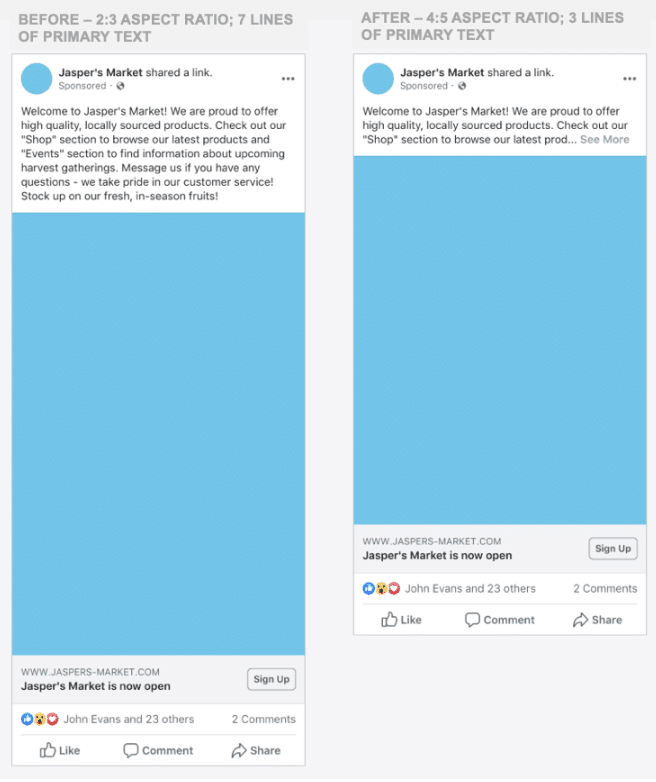
Ads are allowed only three lines of primary text now, as opposed to seven that were previously visible. The other lines are still there, but users need to click “See more” to see the rest of the text.
Image and video sizes have also been reduced. The aspect ratio went from 2:3 to 4:5, which means that vertically-oriented creatives fill less space in the feed.

Why the changes, Facebook? It’s all about the user. By shrinking the visible ad space, users can scroll through their mobile feeds more quickly and view more content in a shorter amount of time. The ability to consumer more content at once enables people to more selectively view content that they really care about.
On the plus side, for advertisers, reducing the maximum aspect ratio for creatives makes it easier to share assets across Facebook and Instagram.
The bottom line to advertisers is that less overall real estate is now devoted to advertising, making it critically important to grab users’ attention more quickly. Those first three lines need to convince users that they want to take action, either to read more of the text or to click on the creative.
Make sure to include the main takeaway message in that first three lines of copy. Lines four through seven should be supplementary information that just supports the main message, since users have to manually click to even read it.
You can also use the ad headline and link descriptions to highlight your unique selling propositions. Use formats like the carousel over a single static image to get more headlines and link description space for copy. The video creation kit template also uses text overlays can help supplement the main message by giving more details about the product or service being offered.
You’ll also want to maximize the impact your creatives will have since they’ll appear in a smaller space. Make images and videos as concise and eye-catching as possible – let the creative “do the talking.” Videos should be thumb-stopping and relay the main message within the first few seconds.
Carousel ads, slideshows, and video creation kit templates all allow for the use of more than one creative asset. That gives you the opportunity to make a big impact within the smaller space allowed.