
Google Ads Dashboards is a highly customizable reporting tool that can help you access relevant data quickly and efficiently. They’re an excellent alternative to building time-consuming ad-hoc Excel reports and give you a convenient hub to quickly digest recent performance.
You’ve likely seen third-party reporting dashboards that agencies build to present performance data to their clients. These might come in the form of monthly or weekly reports or possibly a place for the client to get ad-hoc updates in real-time.
Think of Dashboards as a similar offering right inside Google Ads. You can build highly-visual, custom reports that allow you and your clients to digest important information on an ad hoc or routine basis. As an added bonus, any pre-existing reports saved in your account can be added to a dashboard report as well.
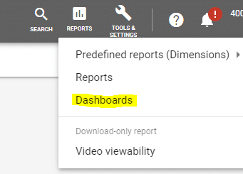
The Dashboards tool is located inside the Google Ads Reports section, as shown above. You can create multiple dashboard reports, which is useful because there are many purposes an individual dashboard report can serve. You could have, for example, a Shopping-specific dashboard, a Search network dashboard, a Display network dashboard, a monthly report dashboard, and a weekly scorecard dashboard. You can slice and dice almost any data you want using filters, which is great for keeping your reports simple and to the point.

A dashboard report starts as a customizable card-based reporting template, as shown below.
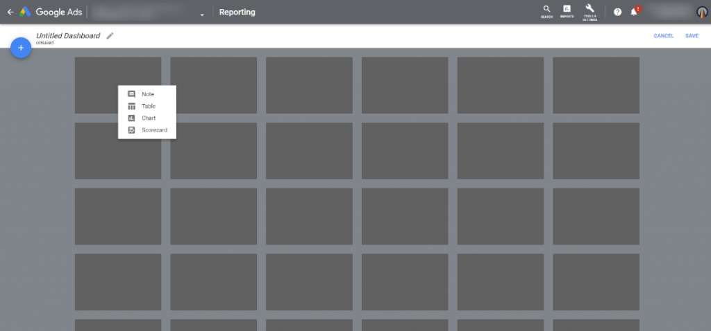
It’s essentially a blank canvas that allows you to drag and drop any relevant notes or reports you want in the form of a card. You’re allowed up to 10 cards per dashboard report, and these can be moved around, stretched, or shrunk to help you present data in a fashion that best suits your goal for the report, like the one shown below.
There are four card types to choose from:
- Note: A simple text field. Write explanations, performance insights, or reference goals.
- Table: A standard data table containing rows and columns of data.
- Chart: Choose between pie charts, line charts, bar charts, stacked bar charts, bubble charts, or scatter charts. If you love interpreting data visually, you can really get creative with charts.
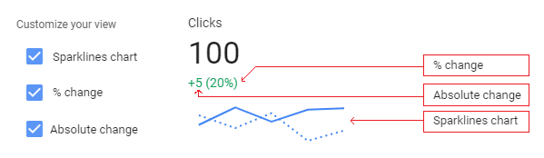
- Scorecard: This one is my favorite. Think of scorecards like a report card for your account. Choose a date range (and comparison date range if you like) and the metrics you’d like to add (such as impressions, clicks, conversions, etc.). If you’re comparing to a previous period, you can customize your view with a sparklines chart, percent change view, and absolute change view, as shown below.
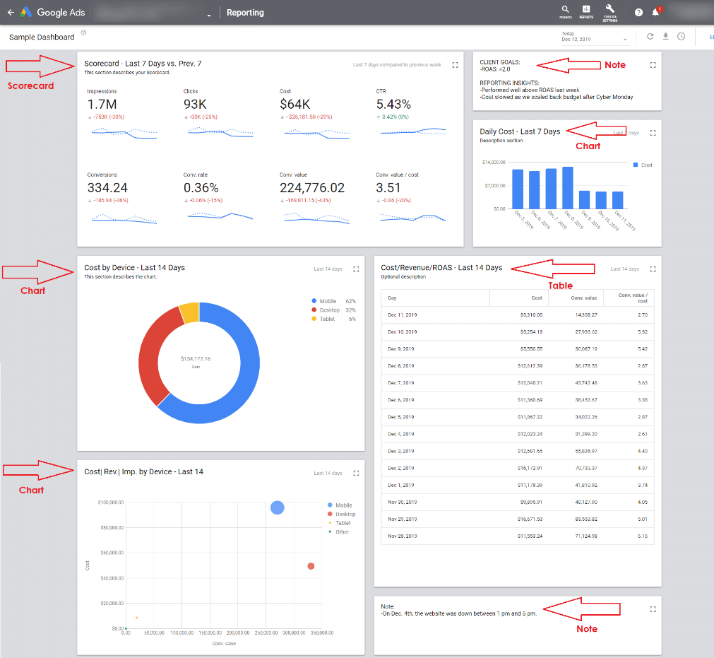
A dashboard report can contain any combination of cards you want. You may have a scorecard at the top, a notes section next to that describing recent optimizations, then tables and charts below that. Think of the data that is most valuable to your program and use the card types to present it in a way that’s easy to digest.
The three dashboards I use most include:
- Scorecard Dashboards:
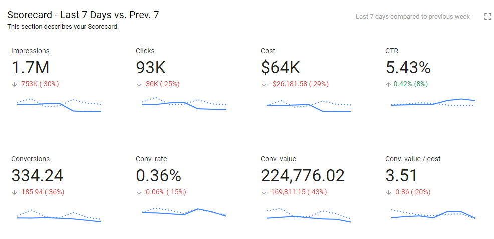
I use scorecards to get a quick update of recent performance versus the previous period – such as the last seven days versus the previous seven days shown above. Adding percent changes and sparklines helps me quickly digest account performance trends.
- Custom Monthly Reports
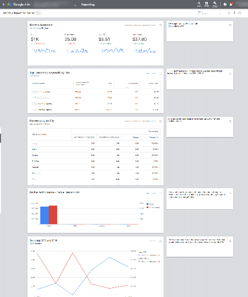
I also build custom monthly reports for clients that want to see specific performance data. If one of my clients wants to see data that our normal monthly report doesn’t detail, I can create a dashboard report to show that data and present it to them during a phone call. These reports will automatically update when you access the dashboard again in future months, as shown in the example above.
For this type of dashboard, the note cards really come in handy. In the example above, I’ve placed notes that are adjacent to each section that I can update with valuable insights prior to each monthly call. Dashboard reports can be also exported as a .pdf files that you can save and email.
- Reporting Hubs for Clients to Access Themselves
I have clients that log into Google Ads on a daily basis looking for information, but they often have trouble navigating the interface to extract the data they’re looking for. That typically results in them contacting me to find the information for them. In the past, I would build a static, one-off Excel report and send it as an email attachment. With Dashboards, I can build that same report once and the client can view the automatically-updated Dashboard as often as they like. It saves me time and gives them instant access to the data – win-win!
Dashboards save you time, they save your clients time, and they provide real solutions to any reporting gaps you might have. There are endless amounts of uses for them, so think about the ways you can use them to your advantage and start experimenting in Google Ads today. You’ll become an expert in no time!