Google Data Studio is a fantastic tool that allows you to take the data from your Google or Microsoft Ads campaigns and transform it into a customizable reporting sandbox that ultimately delivers more insightful reporting to yourself or your customers.
This article will focus on the main benefits of using Google Data Studio, the problems it solves compared to the Google Ads interface’s limited reporting capabilities, and tips on how to get started creating your very first custom Google Data Studio report.
Google Data Studio is a very powerful tool, but—and I will not sugar coat this—it is also a rather overwhelming tool at first because of its inherent complexity. At its core, though, Google Data Studio is a (FREE!) tool that connects to data from a myriad of data sources (Google Ads is just one of them) and then allows you to build fully-customizable reports containing a wide array of tables, charts, and graphs that update as quickly as your actual data source updates.
The customization piece is its main benefit when compared to the lack of customization available inside Google Ads. We’ve all been stuck inside the interface, trying to make sense of the data by manually exporting reports and then piecing together charts inside Excel or Google Sheets. It’s a laborious task at best, and Google Data Studio offers a solution for that.

If you’ve ever been frustrated pulling together complex reports on a daily/weekly/monthly basis, then you should definitely check out what Data Studio can do. The solution it offers is that once you’re inside Data Studio, you just connect to your Google Ads or Microsoft Ads data and build that report once. The power of the data connection then takes over so that report begins to update automatically and in near real-time.
To see examples of Data Studio templates you can use to get started, just go to https://datastudio.google.com/, and then find the “Templates” section.
Building Your First Data Studio Report
If you are a Google Data Studio newbie, I highly encourage your first experience to be one where you just play around inside the tool. Personally, I consider myself “savvy” with Data Studio, but by no means am I a power user. Yet when I was a novice, I found it to be incredibly valuable and satisfying to use. While I am completely self-taught, I have found that if you run into a snag or can’t find a solution (you will), remember, Google search is your friend, and more than very likely, someone has written about that very solution.
So let’s start with the basics. While logged into the Google account you use to access Google Ads, go to https://datastudio.google.com/ and click the create button:
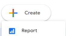
Next, you will be prompted to connect to a data source because what good is a report if there’s no data?
If you’re logged into the correct Google account, your Google Ads account(s) should populate. Select the account and click “Add,” and then you’ll go straight into your very first report with an auto-created table.
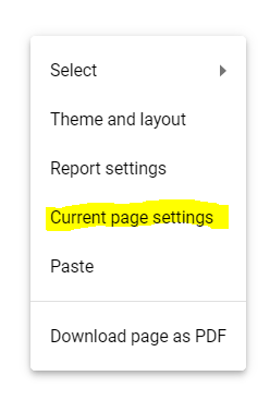
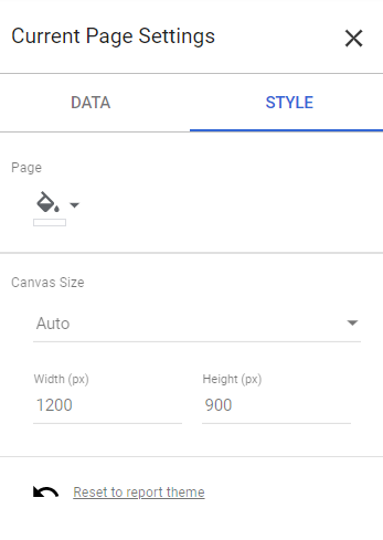
The table sits on top of a page. If you’ve ever made a collage, the page is the piece of paper you stick all your little magazine cutouts of Barry Bonds or Wayne Gretzky onto (really dating myself with that one), and then think of the magazine cutouts as the individual tables, charts, and graphs that you can place onto the page. The page is customizable in terms of size, shape, and even background color. All of this can be customized by right-clicking on the page itself and going to “Current Page Settings.”
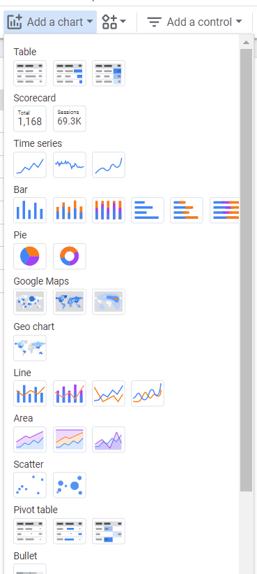
So now that you have your page sized and ready to go, it’s time to think back to what problem you are trying to solve that Google Ads can’t provide. My most common use for Data Studio is to build custom Dashboards at the request of a client. The best place to start here is under the horizontal menu bar, and it’s called “Add a chart”:
Okay, so, in the interest of not turning this article into a thesis, I have to harken back to my “play around with it” advice because this is where that wide array of customization options floods in. Great for you as someone who needs custom reporting solutions, bad for the guy who is writing a finite word blog article.
I’ve equipped you with the tools you need to create a report, connect your data, and start adding charts. From there, it really does require some trial by fire in order to actually start learning the tool. It will really start looking like an actual report once you add text boxes, shapes, images, etc., which are all very easy to find directly in the interface.
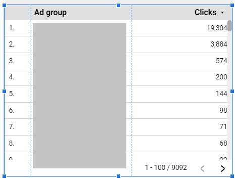
The main component that drives the creation of your charts comes when you click on a specific chart and see the menu on the right-hand side of the screen:
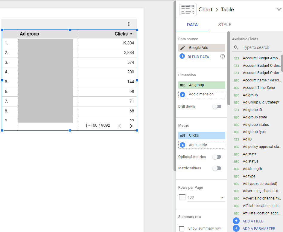
Depending on what type of chart you pick, your customization options will differ. However, what you are essentially doing is taking elements or fields of data available inside Google Ads or Microsoft Ads and using them as Dimensions or Metrics. The Dimensions are typically non-numerical elements you want to report on, and the Metrics contain numerical values (which you can customize into count, sum, average, etc.). In the example above, the Dimension is the Ad group, and the Metric is Clicks.
If you click on that green “Ad group” button, a list of other available Dimensions you can use will populate. Or you can add multiple Dimensions if, say, you want to report on the Campaign and Ad Group level at once.
Again, my advice is to start playing around with it. Build a report that contains multiple tables, multiple graphs, etc. Building them out is the same process regardless of whether it’s a pie chart or a pivot table. Go into a Template, and click “Edit and share” at the top right—then, you can start to see how some of the more complicated graphs are built by clicking into them in Edit mode. I also encourage you to check out the “Welcome to Data Studio! (Start here)” report created by Google to get more familiar with the basics.
In conclusion, Google Data Studio is an overwhelming tool at first. It certainly was for me, at least. But any good PPC expert knows that being able to learn new strategies, tools, or skills on your own is a prerequisite to achieving professional growth. So I encourage you to take the advice given to you today and start building your first report. You will not regret it!
I will leave you with some examples of individual charts that you can create on your own as you start to test its capabilities:
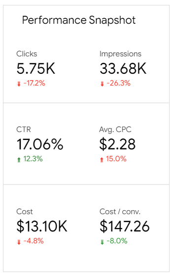
Scorecards:
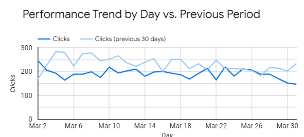
Comparison Graphs:
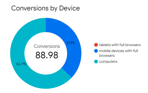
Pie Charts:
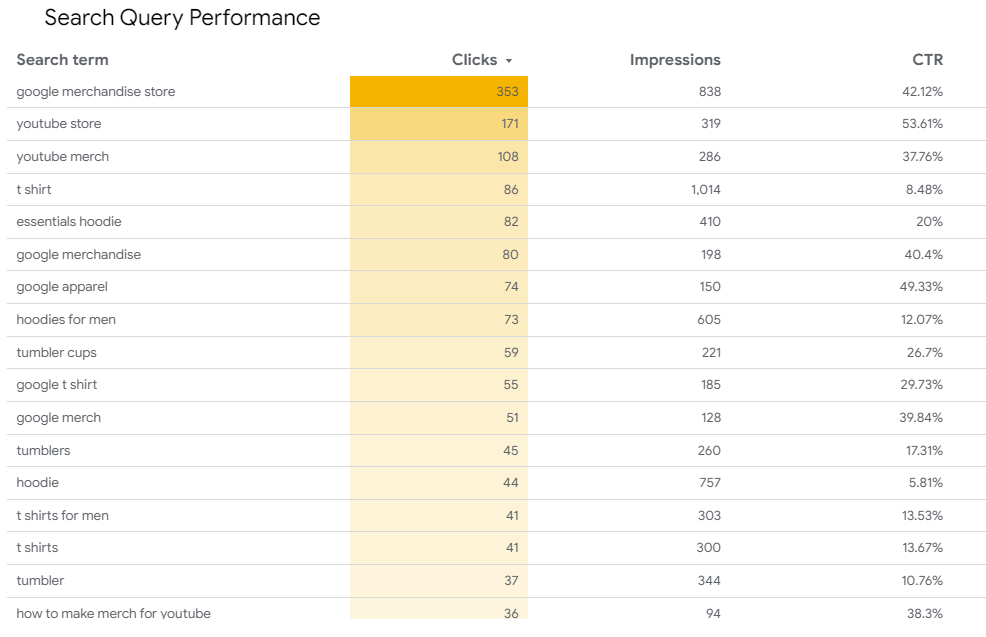
Tables (With Conditional Formatting):
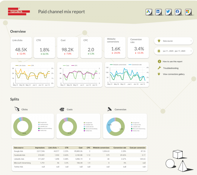
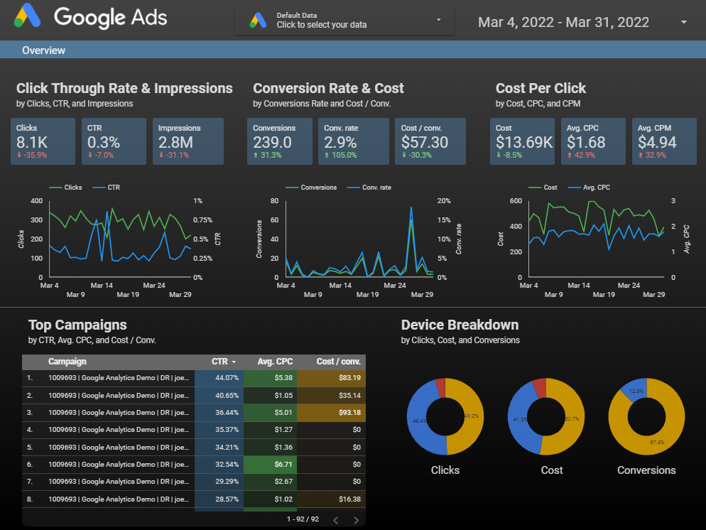
Complete Dashboard Example:
Multi-Channel Dashboard Example: