Brace yourselves, another Amazon navigation change is rolling out! This time, Amazon is polishing the Advertising Console for Vendors and Kindle Direct Publishers.
Amazon is notorious for redesigning the menus and nav bars of their portals, with mixed results. Some updates have been spectacular, such as the recent update to both the Advertising Console and Seller Central’s campaign manager to include filters. Others fall flat, such as the gate-keeper approach in the Seller Support portal that forced a search in the help forms before enabling you to contact support.
What can you expect to change in the Advertising Console? Fortunately, nothing is going away! Amazon claims that this redesign is purely for ease-of-use.
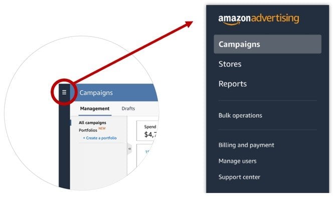
The traditional horizontal top menu bar in the Ad Console is being shifted to a left-hand vertical menu. When you hover over the menu icon – shown above in the red circle – the pop-out menu appears to the right (as shown above, right).

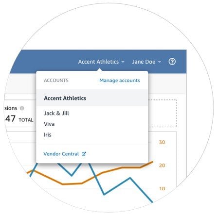
For advertisers like me with multiple Ad Console accounts, the dropdown menu to switch from one account to another is moving to the upper right-hand corner of the top horizontal bar, as shown above.
While change is hard and we will all be clicking around for a few frustrating days or weeks, Amazon argues that this change is for the best. Based on feedback they had received from advertisers, Amazon made the change to provide a more complete and cohesive view when looking for all options available within the Ad Console.
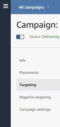
This new vertical menu not only applies to the main navigation, but also to the campaign navigation, as well. The traditional headings of Ads, Placements, Targeting, Negative Targeting, and Campaign Settings are moving to the vertical menu on the left-hand side, as shown above. This menu does not have to be hovered over – it’s always there.
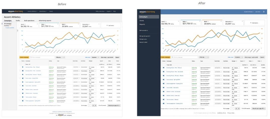
My thoughts on this new layout are mixed. While it is intuitive and familiar, many desktop and mobile sites have moved to an icon menu with a dropdown or pop-out submenu to open up page space, it isn’t significantly more efficient than before. It still takes the same number of clicks to get to the desired function, and the site doesn’t feel significantly less cluttered.
While it’s nice that Amazon is listening to feedback, and investing time and resources to make their products better for advertisers, there were items on my wish list that I would have liked to see before another navigation menu change. I’d rather have additional ad reporting, editable content for Sponsored Brand campaigns, and control over “rest of search” placement bidding to just name a few.
The new design is being slowly rolled out across individual logins. For example, within JumpFly, some account managers see the new view while others still have the previous layout – even while looking at the same client account. Don’t be concerned if a coworker sees the new view and you don’t.